In part 1 of this article I introduced the basic structure of a retrospective and suggested using the 5 step agenda created by Diana Larsen and Esther Derdy in their book “Agile Retrospectives: Making Good Teams Great!”:
1. Set the stage
2. Gather data
3. Generate insights
4. Decide what to do
5. Close the Retrospective
As mentioned earlier, the quality of suggested improvements relies greatly on the outcomes of step 2 and 3, i.e. building a high quality database and drawing conclusions from it.
Having an agenda helps a lot, but does not necessarily guarantee high-quality results. Fortunately, there are a number of techniques you can use to support these steps. We tried out quite a few of them in various projects. I therefore want to give summaries on the ones we found to be most helpful.
If you want descriptions in more detail, you can find them in the book by Derby and Larsen, but also in “Project Retrospectives: A Handbook for Team Reviews” by Norman Kerth.
I suggest reading both of these books to anyone who really wants to get serious about retrospectives.
Timeline
Timelines are used to create a comprehensive overview over the last iteration. As this means gathering data, it is therefore set in step 2 of the agenda. Depending on team size and length of the iteration, we found that it takes us between 30 and 90 minutes to finish this task.
So how does it work?
Each team member writes everything he or she remembers, wheter it’s personally meaningful or any other important event, on cards. These are then sorted chronologically. You don’t have to necessarily use a whiteboard or flipchart to do this. A sheet of paper from a continuous roll will do just as well. According to our experience, count with about 1 meter of paper per week iteration length.
As a variation, you can use cards in different colors to categorize items. E.g., you can use feelings (from happy to sad), event type (technical, organizational, personal), function (technical concept, development, test/QA…) or subject area (team, equipment, customer relations etc.).
If for some reason you can’t come up with different colors, don’t worry: You can still use different categories. Just use different rows for each one. This may not be as optically appealing as having different colors, but it gets the job done.
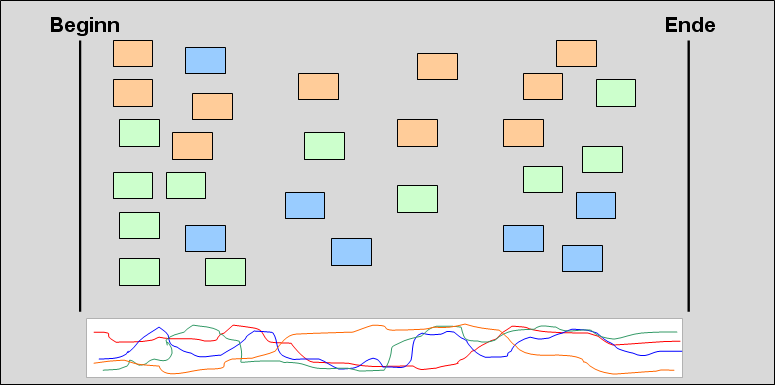
To get to an even larger picture of the last iteration, you can include a so-called “emotional seismograph” in the timeline. This is a graphical representation of emotional ups and downs of all team member over the course of the iteration.
For this purpose, each team member (preferably with his or her own color) draws a line of his/her emotional state throughout the iteration. To avoid team members from influencing each other (“anchoring”), you should use e.g. an overhead projector and let each person write on an individual foil. In the end, just put them all on top of each other.
If you see similar behaviour in different curves (i.e. several team members showing amplitudes at the same time), this can point to a topic worth discussing. To identify it, just have a look at the cards right above the date in question. You’ll surely find it – the likelihood such an emotional event is mentioned somewhere on the cards is relatively high.
You can see an example in the picture right below:
The red, green and blue curve all go up at the beginning and the end of the iteration. Only the orange curve is different. Its behaviour is the exact opposite. A glance at the table shows that the density of cards above these events is very high. Looking at the cards here will surely get you a clue of the real cause. But be warned: Reasons for showing high levels of emotion may be different for different persons. E.g., one person may be angry about broken builds, while another person only sees the effect of not being able to test. The underlying reason (one developer committing non-compilable code), however, may be something completely different. So, you have to establish connections between items manually.
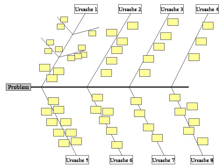
Fishbone diagram
This is also a Phase 2-technique. It can be used to create insights into longer running iterations and also to look behind symptoms in order to identify the real causes.
The team identifies factors that are symptomatic for a specific problem, and then tries to find the most probable causes. Next, they try to find ways how to influence and change them. That’s why fishbone diagrams fall into the category of “cause-effect” diagrams.
Drawing a fishbone diagram will take about 30 to 50 minutes.
How does it work?
Follow these steps:
- Write the problem to be investigated at the head end of the chart
- Draw the “bones” of the fish and label them with the most important influencing factors. If you want to go one step further, you can sort them by importance: The closer to the head, the more important.
- Brainstorm influencing factors for each category (ie each bone) and write them alongside the bone. Alternatively, you can also use post-it notes. If necessary, you can introduce further “sub-bones” to group similar items. However, don’t over-exaggerate here to preserve clarity.
- Repeat steps 2 and 3 until you are fairly sure you covered all relevant factors. You should stop once all new factors you discover lie beyond the control of the team. These would cost too much time. Your goal, however, is not to produce a full-blown diagram but to solve problems. Diagrams are only tools, not deliverables.
- Look at the entries you found. If some of them show up in more than one category, focus on them first. These are the most likely causes of your problems. If possible, focus on solutions the team can implement on its own, as these can be approached directly.
In the end, you now have a list of causes for the investigated problem. You can use it as input for the next 2 phases of the retrospective: Generate a list of tasks (phase 3) and then decide what to do (phase 4).
Here is an example of a fishbone diagram:
Team radar
Team radar is also part of phase 2. Its purpose is to help the team get an overview of how well it performs in various disciplines, like communication, feedback, development practices etc.
Drawing such a graph, fortunately, takes much less time than the previous techniques. 15 to 20 minutes should be sufficient.
<–>
How does it work?
Draw all measurables in a coordinate system, each one with its own axis. Now allow each team member to draw his or her evaluation into the diagram. Similar to the emotional seismograph, you can also use an overhead projector and foils to avoid anchoring.
If all team members have finished writing down their evaluations, take a look at them. If there is much variation, this can be worth discussing. Of course, you can also try to compute a single value, e.g. by calculating the arithmetic mean, discussing etc.
Repeat this for all measurables. Then, join all the dots to get a graph resembling a radar image. Here is an example:
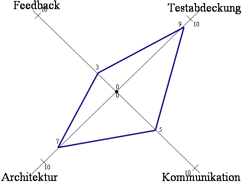
Repeat this as part of every retrospective. This way you can compare it to the graph from last time and see if you make progress.
Forcefield analysis
A forcefield analysis is a (relatively simple) method to analyse helping and hindering forces that influence a situation and is typically used in phase 4 (“Decide what to do”). It is based upon data acquired in preceding phases.
Doing it shall take you about 45 to 60 minutes.
How does it work?
The team defines a goal to be achieved and writes it on top of a chart. Then it creates 2 columns, one for helping, one for hindering factors.
You then write down all factors you know (and which you identified earlier in the retrospective) in the appropriate column and assign them a strength. Usually, you would use arrows of different size to reflect that. All arrows point to the middle (because this is where the goal is).
In the end, the picture will look something like this:

To achieve the desired goal, you can do either one of two things:
1. You can strengthen helping factors
2. You can weaken hindering factors.
In the above example, you should therefore reinforce factor 2 and 3 and weaken factor 7 and 10. But you should always consider which factors the team can influence in the first place. Many times, a team can make more of a difference than they think. But if big factors lie outside the team, it can be more efficient to put them aside for some time as outside factors typically take much longer to resolve.
Using force field analysis will enable you to evaluate the forces working for and against you. This information may help you when estimating the time it takes to resolve a specific problem. This way, you can better estimate whether an effort is worth the time or not.
Looking at all the techniques described above, it now becomes clear why retrospectives can take up to half a day (given a 4-week-sprint).
At first glance this may seem to be a bit high (retrospectives don’t add new functionality to your product), but it’s definitely worth the time. The improvements you’ll find will more than make it up. At least this was the case in our projects.
Moreover, and this seems to often be forgotten, a continuous improvement process also contributes to team satisfaction. This alone would make retrospectives worth the time – because only a satisfied team is a productive team!
BFI
